Project Overview
Tiny Trails is a nature-inspired children’s exploration brand focused on introducing young kids to outdoor learning and adventure. The goal was to create a playful, approachable, and visually engaging brand that would appeal to both children and their parents, while staying rooted in nature and education. The project included developing a full brand identity that blends whimsy with professionalism, making Tiny Trails feel both fun and trustworthy.
Strategy
MISSION & PURPOSE
Helping young children and their families reconnect with nature through simple, joyful outdoor experiences.
TARGET AUDIENCE
Parents of toddlers and preschoolers who value learning through play, outdoor exploration, and early education, seeking easy ways to introduce their children to nature in simple, approachable ways.
MARKET POSITION
Tiny Trails fills a unique niche by blending educational outdoor activities with playful, accessible design. The brand balances fun, simplicity, and trust to create a resource parents feel confident using with their young children.
BRAND PERSONALITY
Warm, playful, and encouraging with a strong connection to nature. The tone is lighthearted, inviting, and gently educational, inspiring kids and parents to explore and learn together.
With a clear strategy in place, we crafted a brand identity that brings Tiny Trails’ mission to life. Blending playful design, warm colors, and natural elements to inspire young explorers and build trust with parents.
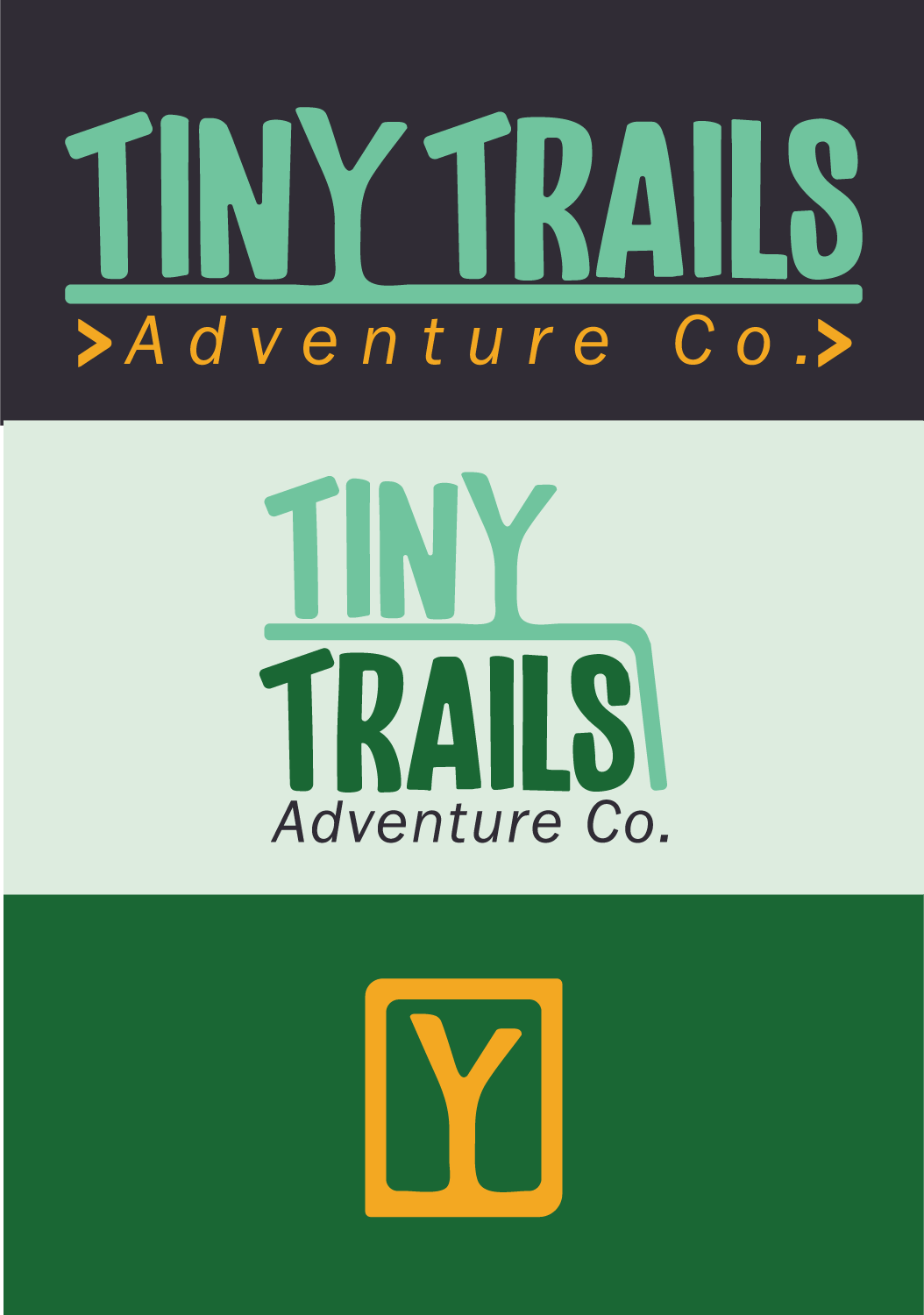
Primary Logo:
The main logo represents the full brand identity, combining playful typography with natural elements to capture the essence of Tiny Trails.
Secondary Logo:
A simplified version designed for flexible use across a variety of brand materials while maintaining visual consistency.
Logo Mark:
A standalone icon inspired by nature and exploration, perfect for use at smaller sizes or as a recognizable brand stamp
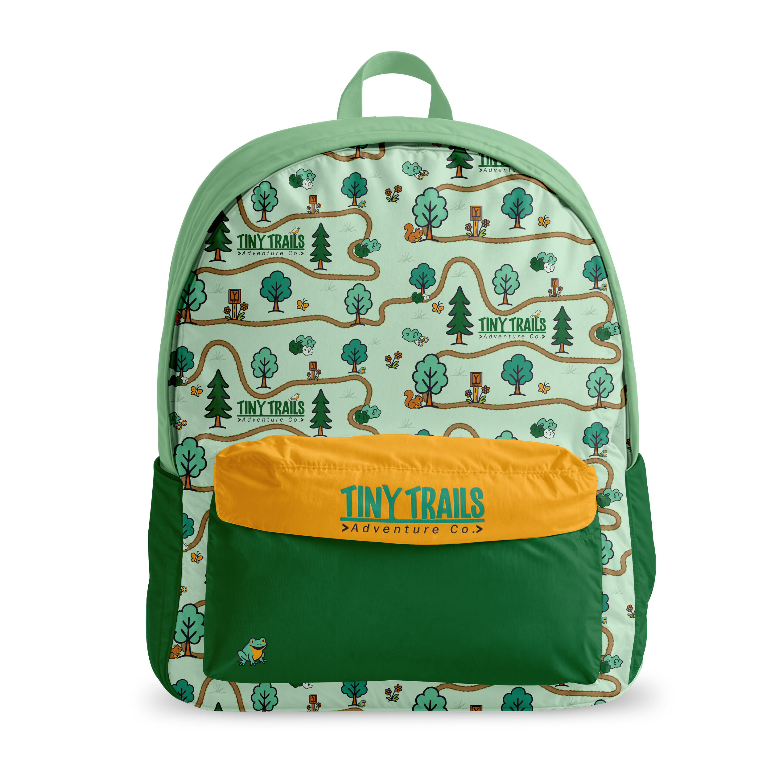
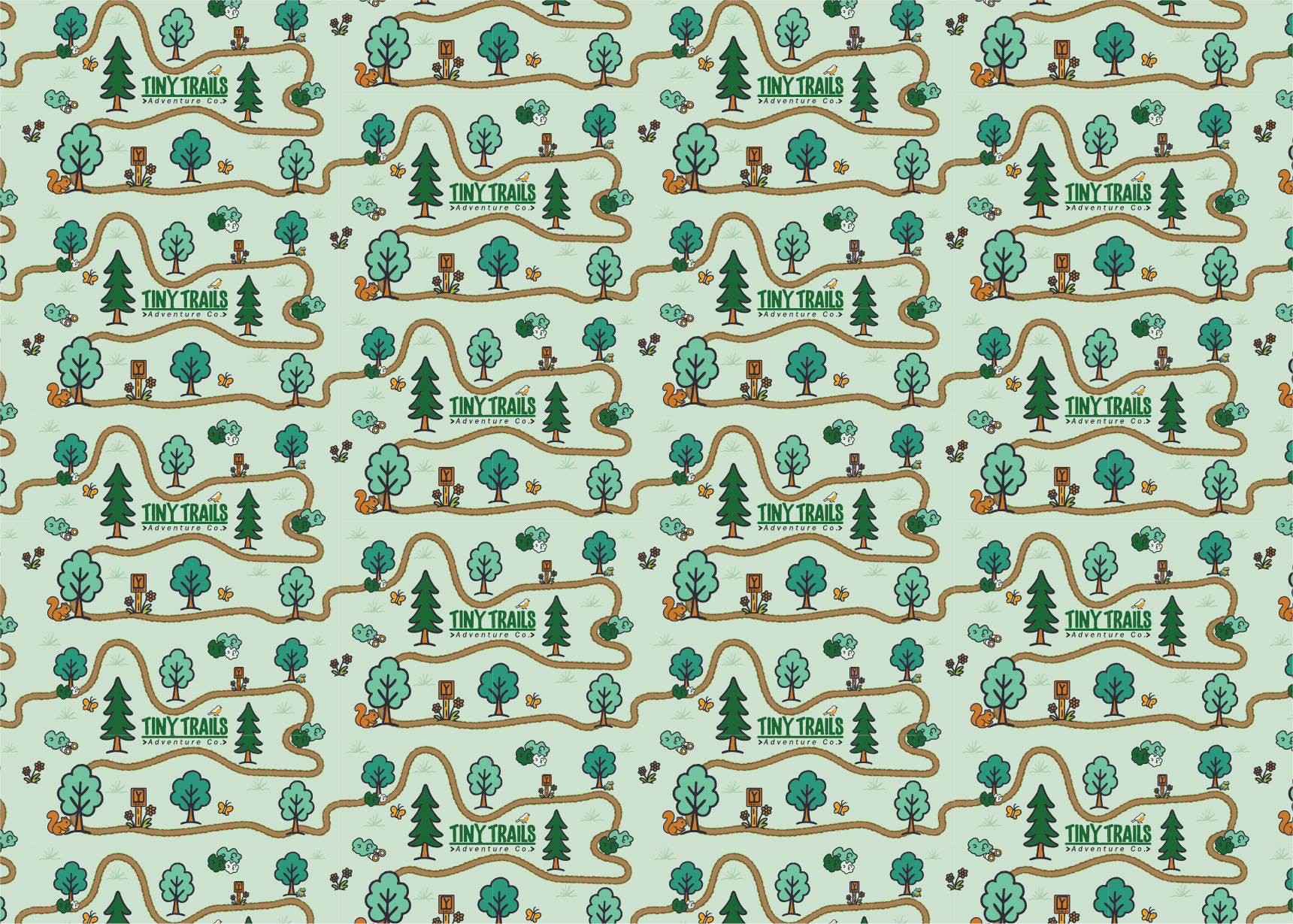
Brand Assets
& Support Materials
In addition to the core logo suite, we developed a full set of supporting brand elements to ensure Tiny Trails has everything needed for a consistent, polished presence. This included a custom color palette, font pairings, simple iconography, and brand patterns to extend the visual system across digital and print materials. All final files were organized and delivered with a detailed brand guide, giving the client clear direction and confidence to apply their new brand consistently moving forward.